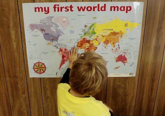
Walk into most any classroom, and you will see a large world map hanging somewhere on the wall. Teachers use maps for subjects like geography and social studies. In the United States and other countries, school children have long learned from one kind of world map. It is called the Mercator projection. This version of map is more than 400 years old. Gerardus Mercator, a European mapmaker, designed it for the purpose of helping sailors and ships on the high seas. Today, the Mercator projection is the map of choice for modern-day direction-finding services like Apple Maps and Google Maps. It is also the map of choice in school classrooms and textbooks. But map experts and other people say the Mercator projection should not be used in schools. They say it does not correctly show the sizes of countries and continents. It is not an easy thing to show our three-dimensional planet in just two dimensions length and width. Gerardus Mercator’s 16th-century method made countries far from Earth’s equator appear larger than they are. Countries close to the equator appear small in comparison. On Mercator maps, for example, Africa appears smaller than North America. In reality, the African continent is larger than all of North America. Mercator maps also make Greenland appear bigger than China. In fact, China is about four times larger than Greenland. Now, school officials in the U.S. state of Massachusetts are replacing the Mercator map with one that presents a different view of the world. Boston Public Schools is America’s oldest public school system. It is also the first-known American school system to use the Gall-Peters projection world map.
What does projection mean?
classroom project
provide directions
a new map
an estimate
What subjects use maps?
geography and social studies
recess
reading and literature
math and science
Countries close to the equator appear small.
the same
distorted
small
large